Week 16: Documentation & User Requests
User requests
Browser support
As mentioned in last weeks blog post, we were informed by users that our platform did not work on Internet Explorer 11 (previously we only tested on Chrome). We realised that this is a big issue as our users are Microsoft-based and found out that they actually don’t have access to Chrome. We therefore begun to debug and found the cause of the problem.
It seems most of the issues were coming from the react-wordcloud library we were using (https://www.npmjs.com/package/react-wordcloud), which uses D3 which doesn’t by default support IE11. To solve this issue and get our platform working on IE 11, we now transpile the package and all its D3 dependencies using Babel.
After this fix, the functionality of our platform now works on IE however there were some remaining styling issues. We went through all the sites pages and the only problem was some styling with the footer. Upon further research we found that this is may have come from using flex-wrap and flex which have some compatibility issues with IE.
To solve this we used an alternative to flex, CSS grid. However once we made this change we realised there were some issues with grid so we researched further. We learned that only some of grid started to be supported in IE 10, with some grid syntax still not compatible. To combat this we used ms-grid which is the IE implementation of CSS Grid in conjunction with the @supports CSS syntax so that ms-grid is used for non-compatible browsers and grid is used for other browsers. This combination resulted in a responsive footer which looks good on IE 11 and other browsers.
Clean up homepage
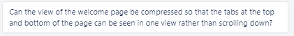
Another user request this week was to compress the homepage so that no scrolling would be needed to access everything:
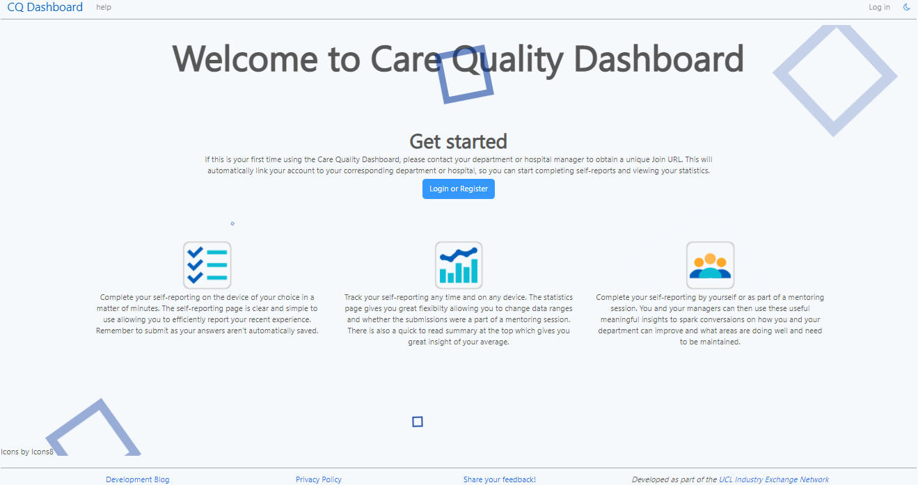
We thought this was a great suggestion as we were not sure how to finalise the homepage and this route also means that it is efficient to access everything. To implement this we changed a lot of the styling and how the spacing is done. In addition to this, as the whole page fits in one view, we removed the features button which previously scrolled down to the features button. Lastly we removed the text that informed the user this is a demo because this is now close to the final platform. This is how the cleaned up homepage looks:
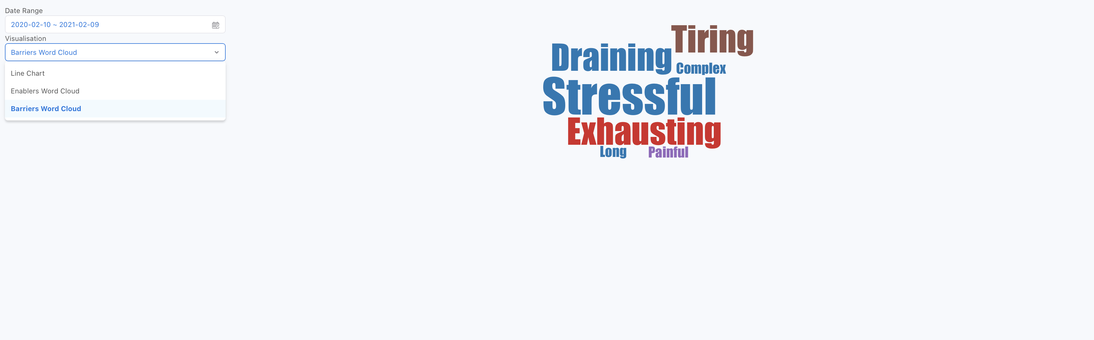
Word cloud
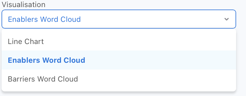
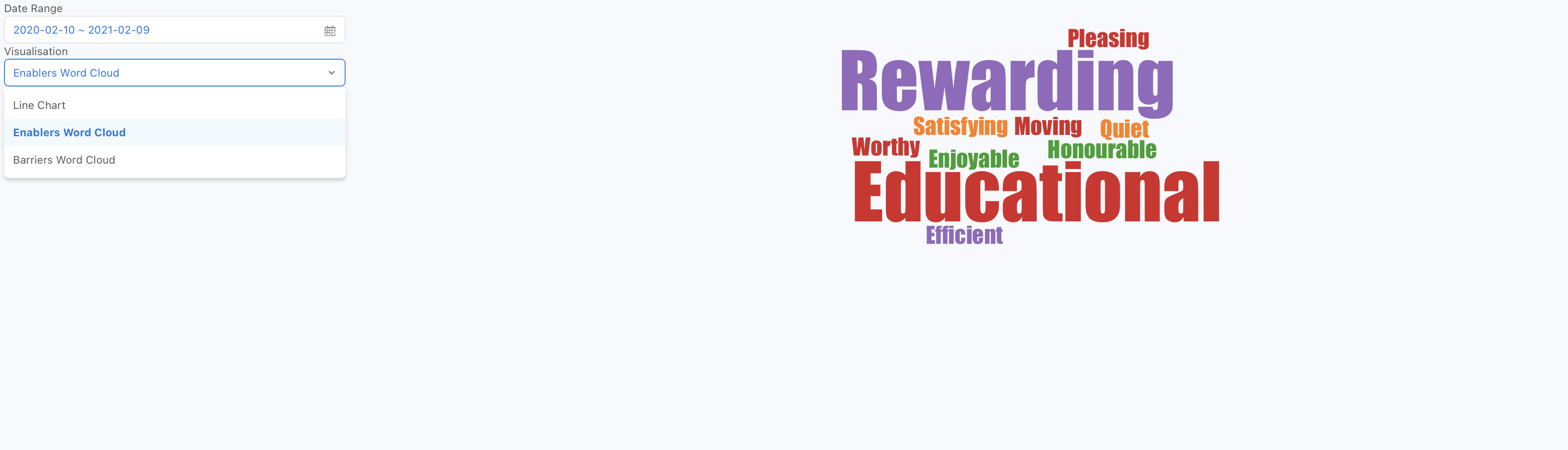
One of the user requests was the ability to separate the initial word cloud that has all the words from the word-based questions in the self-report. We thought this was a very good idea as this will mean more clarity for the user when analysing the word cloud. There will now be two separate word clouds shown: one for enablers and a separate one for barriers.
We have changed the Visualisation Filter, to now have an “enablers word cloud” and a “barriers word cloud” option. When the user clicks on Enablers, they will see only the words corresponding to the positive feedback and the opposite when they click on Barriers.
Documentation
User manual
To begin our documentation we decided to create a user manual — this will hopefully mean that users will be clear about the platform and its functionality so they know how it can be used to solve their problem and navigate the platform independently.
We split the manual into sections for each of the core pages of the platform, and split these sections to write about between us. Within each section, different subsections target different user types, so it’s easier for them to see the exact functionality and UI available to them.
The guide consists of clear instructions on how to complete different tasks on the platform and how to use it. Throughout the guide there are also screenshots to take the user through each step. You can view the guide here.
Frontend Docs
In order to make our code handover as easy as possible, and ensure the codebase is maintainable, we began documenting our frontend this week.
As a first step, we researched on possible documentation techniques for a React/Next.js-based app, and discovered:
-
Storybook (“an open source tool for developing UI components in isolation for React…”)
We decided against using this as it seemed more targeted towards those who want to create new components (in isolation), rather than document existing components
-
React Styleguidist (“isolated React component development environment with a living style guide”)
At first glance, this seemed very user-friendly and whilst also a component development environment, the rendered documentation appealed to us due to features like a ‘playground’, where developers can tweak component example snippets to see how different props affect the rendered output.
Unfortunately, after a lot of investigation and debugging, we were not able to get this to work with our platform’s CSS Modules usage — the way React Styleguidist was importing the modules meant our CSS would not work out-of-the-box, and changing our codebase to make this system work was not something we were keen on doing.
-
Docz (“it’s never been easier to document your things!”)
We settled on Docz, a simple documentation generator that uses
.mdx(Markdown + JSX) files in your folder structure to document each of our components.In conjunction with React’s
PropTypes(https://reactjs.org/docs/typechecking-with-proptypes.html), this is ideal as it produces clean, developer-friendly documentation, that’s easily edited and integrated into our codebase.
We configured GitHub Actions to ‘build’ these docs on every push to main and deploy them to a new branch gh-pages to be viewed on our GitHub Pages website.
Our frontend docs can be found here.
Backend Docs
We also began documenting our backend this week, to ensure our codebase is maintainable and understandable to 3rd-party developers.
Similar to with the frontend, we performed research to determine our options. Our backend primarily consists of a REST API which is what we wanted to document, for example, if the new developers wanted to build a different UI but use the same backend it would be useful for them to have documentation on the API our site uses.
We decided to produce an OpenAPI specification for our REST API, as this seemed to be the most common technique to document them. However, we wanted this to be as integrated into the codebase as possible, to reduce the chances of the codebase getting out of sync with the docs.
As a result, we are now using swagger-jsdoc to document our API routes within each route handler file, using JSDoc syntax to write out YAML-formatted OpenAPI descriptions of each route.
As with the frontend docs, we’ve configured GitHub Actions to generate the specification on every push to main, and deploy them to our GitHub pages website.
Our backend REST API docs can be found here.
Next steps
Our next steps over the next few weeks (by the end of February) consist of:
-
Continuing to receive and act on feedback from our users (user-acceptance testing)
We have a meeting with them this week where we will be talking more in depth about their review about their experiences of the platform.
- Reinforcing code quality in the codebase
- Finalising our frontend and backend documentation
- Creating a test suite for our frontend and backend