Week 14: Polishing & User Acceptance Testing
This week we worked on issues related to polishing the platform, and created a User Acceptance Testing feedback form which will be distributed to our users by our client in the coming days.
Development: frontend
Server Side Rendering
As part of our ‘polishing’ work, we wanted to improve the User Experience by removing the ‘flashes’ that occurred when e.g. the header was switching between the default ‘not logged in’ state and the correct state for the logged-in user.
This ‘flash’ occurred because we were using client-side rendering, with the session being fetched on every page load and then re-rendering the contents of the page.
The main disadvantage of this was that every page defaulted to ‘not logged in’ on first load, which hinders the user experience as they see this ‘flash’ of content, and may be confused by the initial (incorrect state).
To fix this, we are now using Server Side Rendering for each of the initial page loads. This was one of the core advantages of us for picking Next.js as our framework at the beginning of the project, and we have now implemented this such that the initially rendered HTML for every user is correct for their logged-in state.
Importantly, all other changes and updates to the UI are stateful, and dynamic, using our REST API (i.e. client-side rendered).
Responsiveness
A conversation we had with our client at the beginning of the project was what devices users will be using to access the platform. We were told that we should expect them to be using any sort of device, ranging from mobiles or tablets, to desktops/laptops.
This means we need a fully responsive UI such that the platform is usable on various different screen sizes.
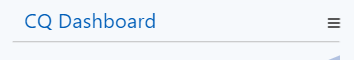
We went through all our pages and components this week and updated the CSS to ensure they are all fully responsive now. One of the main areas we had to work on was the Header, which was overflowing when using small screen sizes. It now looks like the following, with a ‘hamburger’ menu that appears with the navigation options when necessary:
When clicked, the menu looks like the following:
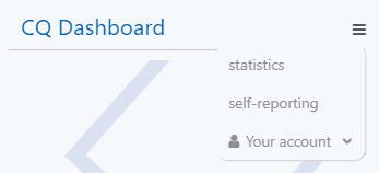
Most of the responsiveness was achieved by use of CSS Media Queries which allow us to target different CSS rules based on the screen sizes of our users.
Dark theme
As part of our polishing we decided a nice addition to our platform would be implementing a dark theme that users can switch to if they prefer. A dark theme/mode is a really common feature in most popular platforms for example google and twitter, so we felt that it would give the platform a more professional feel and also benefit users who are used to using dark mode elsewhere.
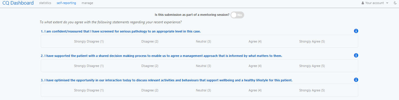
To implement our dark theme we used CSS variables for the different colours used on the platform and toggled them using document.body.classList.toggle() to the corresponding colours for normal or dark theme. A comparison of how the self reporting page looks in normal and dark theme:
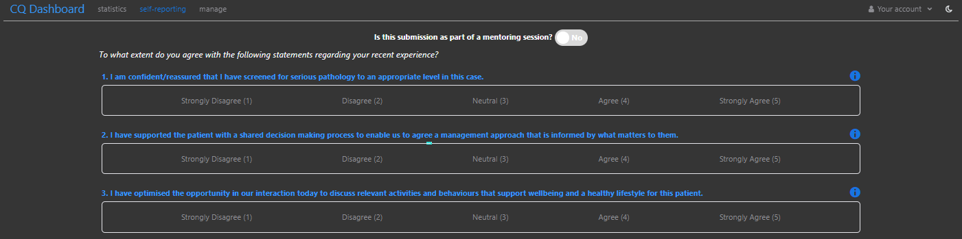
The user can then change this theme using a moon button in the header which we created using the React Suite <Button> component in conjunction with the <Icon>:
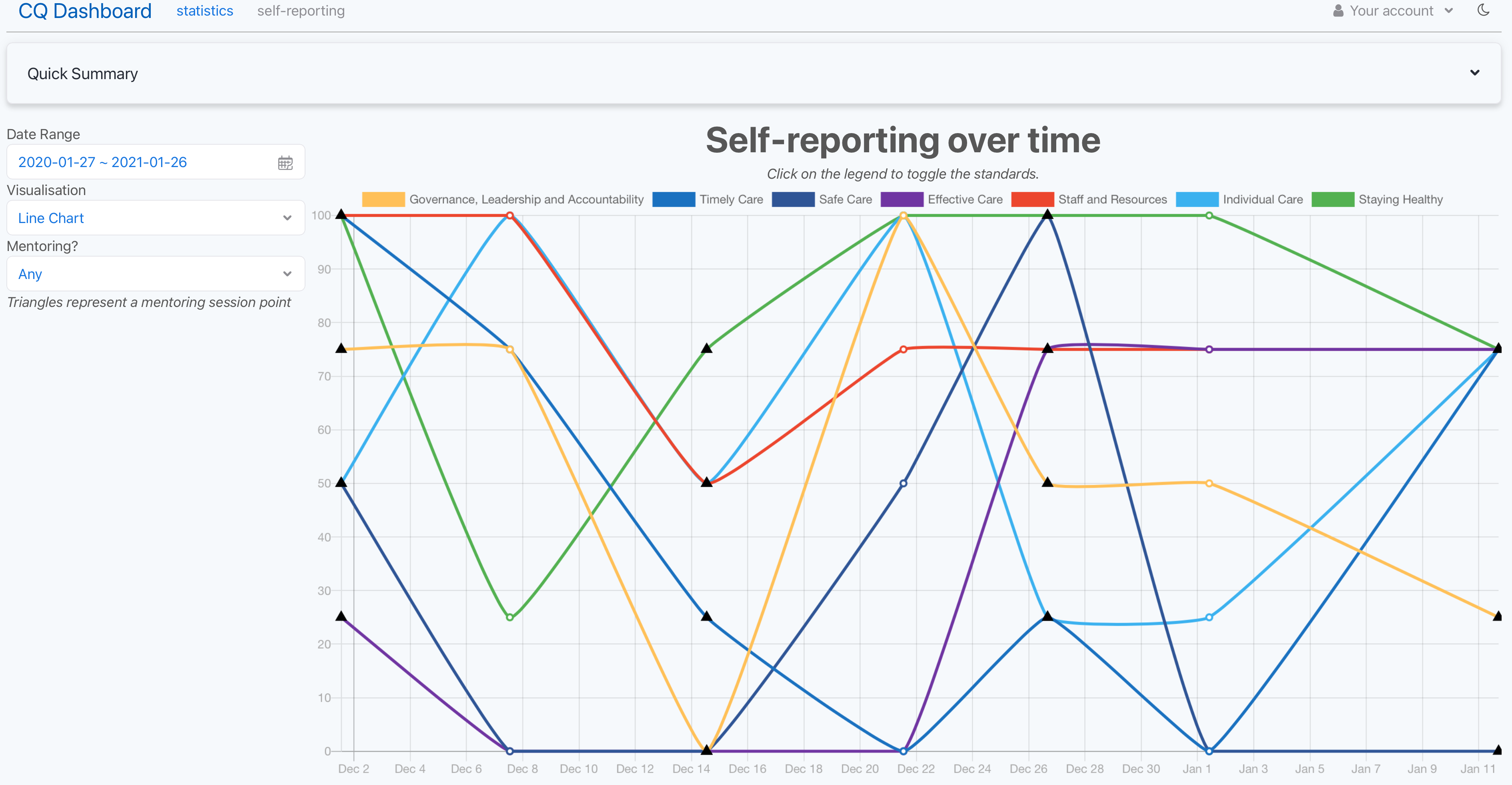
Statistics Page
As part of finalising the statistics page, over the week we worked on improving the user experience.
To do so, we started by adding an italic text at the top of the page so that the user knows that they can click on the different legend labels to toggle the standards shown on the line chart.
We also fixed the Governance standard’s colour which also improved readability of the line chart. We also added a grid to make the graph more readable and fixed the dates in the X axis which rendered incorrectly when data points spanned over different years.
In addition, we made the hover-over tooltip display whether the session is a mentoring one or not, enabling the user to have a clearer understanding about the significance of particular points.
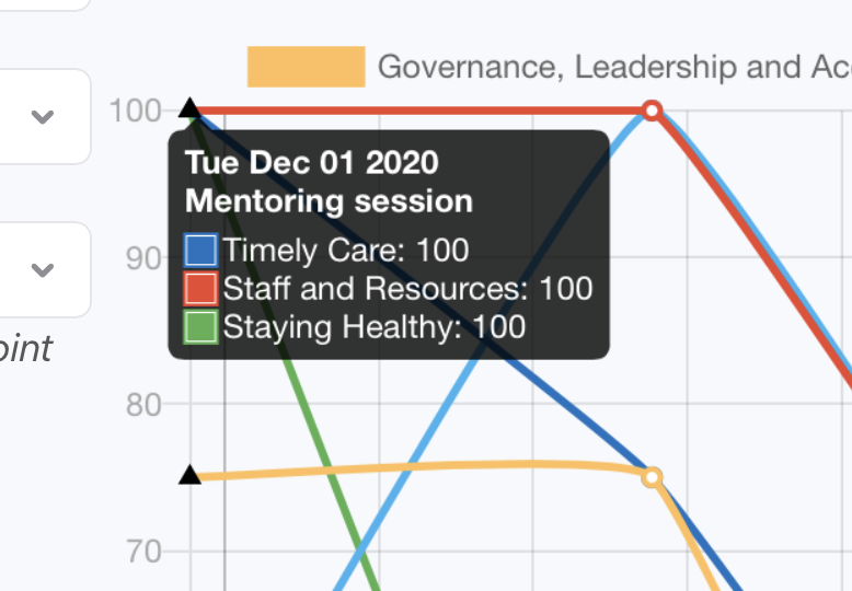
Finally, following our meeting with our client, we made it possible to better distinguish if a particular point is a mentoring session or not on the line chart itself. We used the Chart.js documentation to find the point-styles (https://www.chartjs.org/docs/latest/configuration/elements.html#point-styles) property which we are now using to represent any mentoring session points by triangles, making it easy for users to distinguish them with a non mentoring session point at a glance.
This is particularly helpful when the user selects “Any” in the mentoring filters as this shows both non mentoring and mentoring session points. We’ve also added an italic description under the filter to explain that a triangle corresponds to a mentoring session point to aid in user understanding.
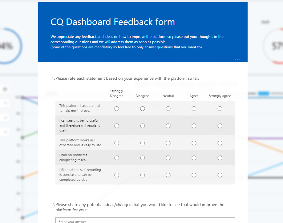
Feedback mechanism
After reviewing our MoSCoW requirements we realised that we were still missing a feedback mechanism on the platform for users to share their ideas or potential problems.
We had a choice between creating our own form on the platform and storing feedback in our database or using an external tool and linking to it. After discussing with our client we decided that the best solution was using a Microsoft form as a feedback mechanism, as:
- It would mean we store less data in our own database
- Our client informed us that our users are heavily Microsoft based and all the applications they use currently are from Microsoft, so using a Microsoft form would not create an additional dependency (for example we were debating using Trello which would add another dependency) and users will feel like they’re using something already part of their current workflow
- Microsoft Forms support email notifications when receiving responses, so the administrators we hand over the platform to can instantly get notified of new feedback without having to check
- Microsoft Forms gives a clean dashboard in which feedback can be analysed
- Microsoft Forms doesn’t require users to create an account to leave feedback (unlike e.g. Trello)
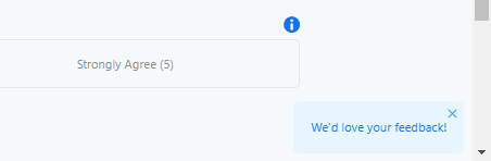
To implement this feedback mechanism we created a new component called <FeedbackNotification> which uses the React Suite <Message> component where we link to the feedback form.
We decided to only display this on pages that logged in users can see to ensure we don’t receive spam/fake feedback. This is how it looks on the self reporting page:
An excerpt from the feedback Microsoft Form is below:
Development: backend
Before finalising our User Acceptance Testing form (see next section for more details), we went through the entire platform, starting from an unregistered user, through to submitting a self-report and browsing the statistics.
This revealed various bugs and UX problems which we decided to solve before sending out the UAT form.
Some of the problems and their solutions are below:
-
Faulty sign out logic
We noticed that when a user logged out of the platform using the Sign Out button, and then they logged in again, they weren’t prompted for their credentials again.
We viewed this as a security risk, as if a user clicked the sign out button, they would expect the session to be completely destroyed.
After investigation, the cause of this was determined to be the fact that NextAuth.js only deletes the local session cookie when signing out — not the Keycloak session itself.
After research we were unable to find a way to force the Keycloak session to be destroyed via NextAuth.js by default, so we implemented logic to use the Keycloak Admin REST API to destroy a user’s sessions when they log out via NextAuth.js at the same time — this has the effect of ensuring they re-enter their credentials the next time they log in.
-
Faulty Join Code registration flow
We noticed that when a user visited a Join URL directly from their address bar, and completed the registration process, we received a Next.js error along the lines of
window not defined. This is because we were signing out the user and redirecting them to the homepage when they successfully joined a department.This was originally occurring because we needed the session state to be updated when the user joined a new department, as that is where details such as their department ID were being stored, and NextAuth.js didn’t have a default way to update the session data without re-logging in the user.
Unfortunately, after discovering this bug we had to perform more research to discover an alternative solution, to no avail.
In the end, we have now updated our session logic to refetch the user’s ‘profile’ information from Keycloak every time the session data is requested in our code. This means that if the data updates for whatever reason in between a user logging in and logging out, we will automatically fetch and return that data.
This is much more convenient for the user (they don’t have to re-log-in), and removes the risk of a user’s permissions being stale when using the platform — this could in fact have been considered a security risk originally.
-
Impractical dummy data
Our seed scripts was originally adding quite impractical dummy data to the database for debugging and development purposes.
This data was impractical because it contained assumptions such as: every user will enter every word for the word-questions every time; every user will submit a response exactly every 7 days; every user belongs to a single department; there was only one hospital.
This made development and debugging harder as we were constantly developing with these assumptions in mind, making it harder to spot bugs that we weren’t looking for.
We’ve now updated our seed scripts to remove these assumptions, and add more varied data.
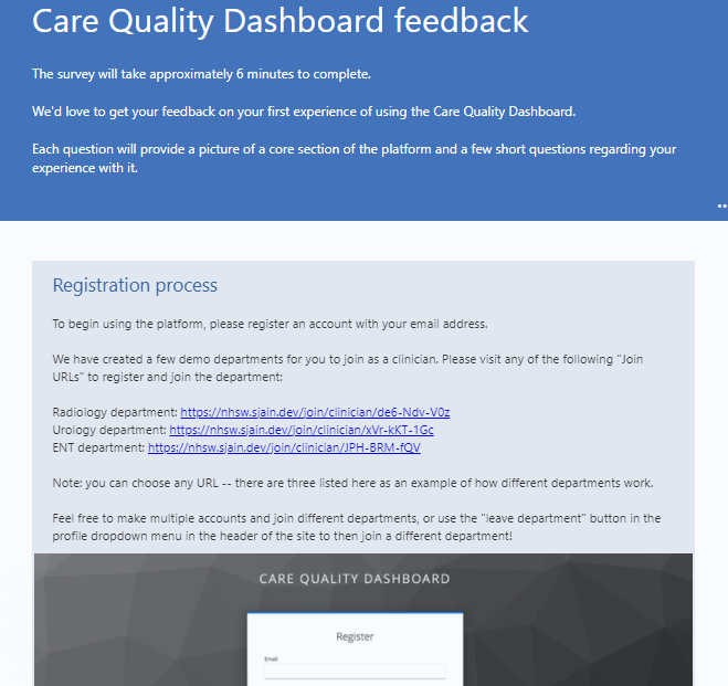
User Acceptance Testing (UAT)
Having finishing our MVP target we moved on to creating a User Acceptance Testing (UAT) form which will allow us to start getting feedback from our users (clinicians).
We decided to have an intro at the top introducing the platform and giving instructions on how to log in/register. We split the form into different sections corresponding to our platform: registration process, self reporting page, statistics page, manage page and finally an overall thought section. We hope users will be able to use these sections as a guide on navigating around the site themselves, and prompting them to provide valuable feedback to us.
An excerpt of the UAT form is below:
Next steps
We will continue to work on polishing up the platform, and hopefully receive responses from our users via the UAT form on which we can take any relevant actions neccessary.
Some of the tasks remaining are:
- Improving error handling throughout the project
- Finalising the landing page
- Implementing a site-wide footer
- Finalising the dark theme
- Creating more useful error pages