Week 3: Sketching, Prototyping & Evaluation
This week, we concentrated on sketching, prototyping and evaluation of our product. In the previous week, we were able to gather our requirements from our users and hence complete our personas & scenarios.
We used an user centered iterative approach in order to make the best sketch and finally prototype of our product. In order to do so, we organized 2 calls this week on Zoom with our users, one after we finished our first version of the sketch, the other after we finished our final version of the sketch and our first version of the prototype.
Sketching
We started by sketching the first version of our product on paper but we were struggling with the most optimized design for the dashboard. We used Miro as a tool to sketch our design.
The initial design had a homepage, self-assessment page (Likert scale questions/optional comment questions), manage users/questions page (for department heads), and a statistics page (to visualize and filter data for different groups depending on your position).Sketches 5 & 6 are alternative designs where we experimented with different homepage versions (e.g. with sidebar/extra educational content).
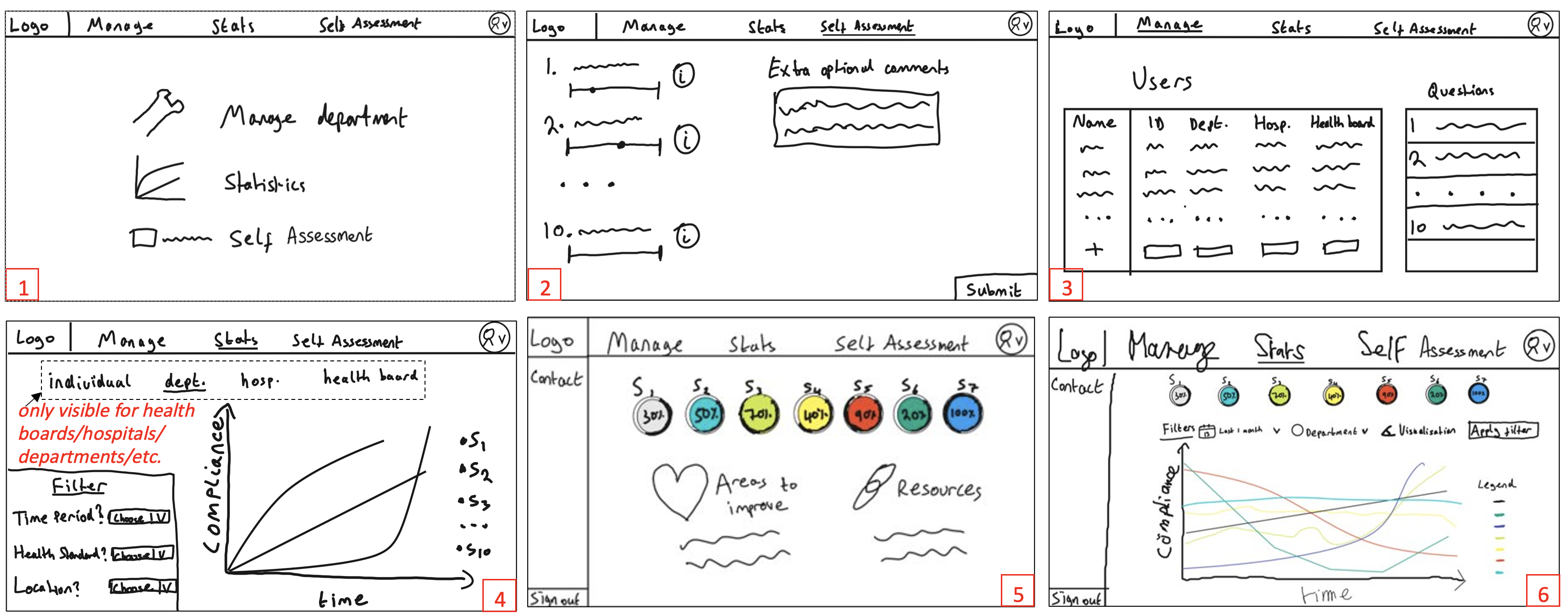
First version of the sketch
Revised Sketches
After making our sketch and getting feedback from our users, we combined the homepage/statistics pages based on what users would most commonly use and added visual color coded indicators of average compliance to-date. We removed the sidebar and the text-based questions to simplify the layout and avoid overwhelming users. The manage users/questions functionality was split into separate pages, with new intuitive table layouts and an “export CSV” option.
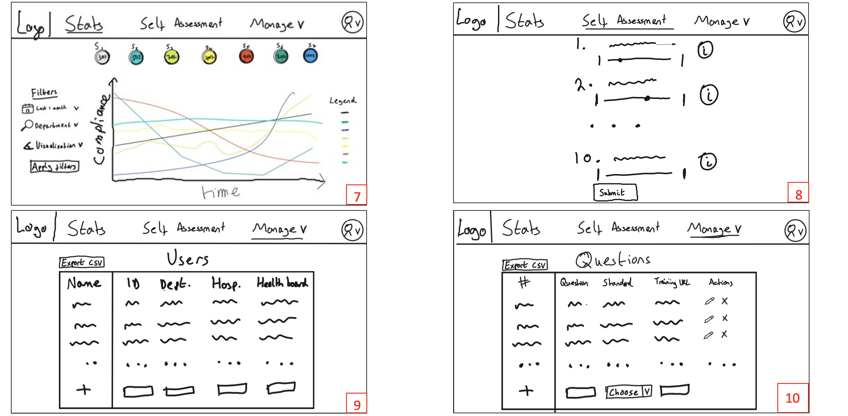
Final version of the sketch
Prototyping
Our sketches formed the basis of an interactive prototype we created using Figma. We asked a user to interact with this via Zoom screen-share and the Figma Present functionality.
The screenshots below shows the various web pages as the department manager navigated around the prototype. Only managers see the “Manage” navigation menu and pages. Hospitals and Health Boards will only see the Statistics page and will have a “department” filter on this page. The prototype has different headers for the different user groups of our product.
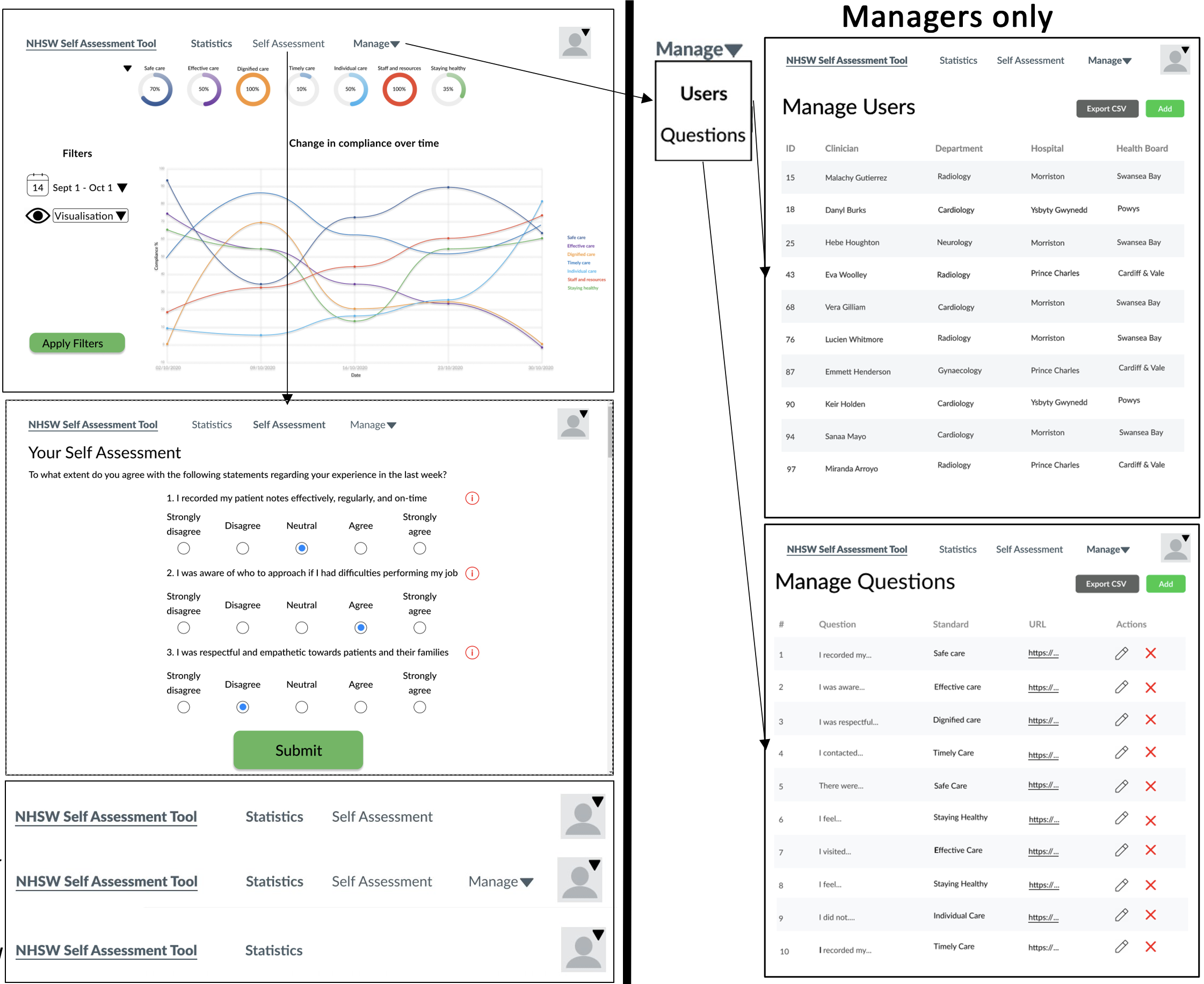
First version of our prototype
Evaluation of Prototype and final design choices
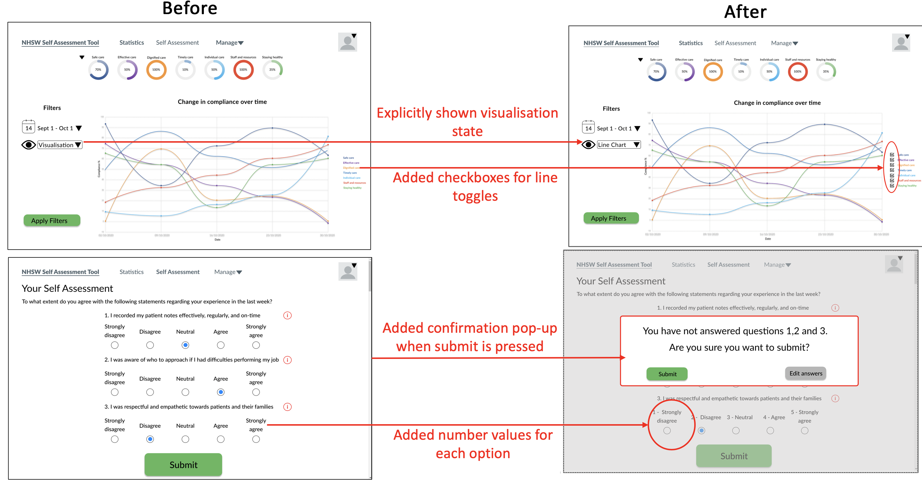
We then made revisions on the prototype after consulting with our client and created the following table.
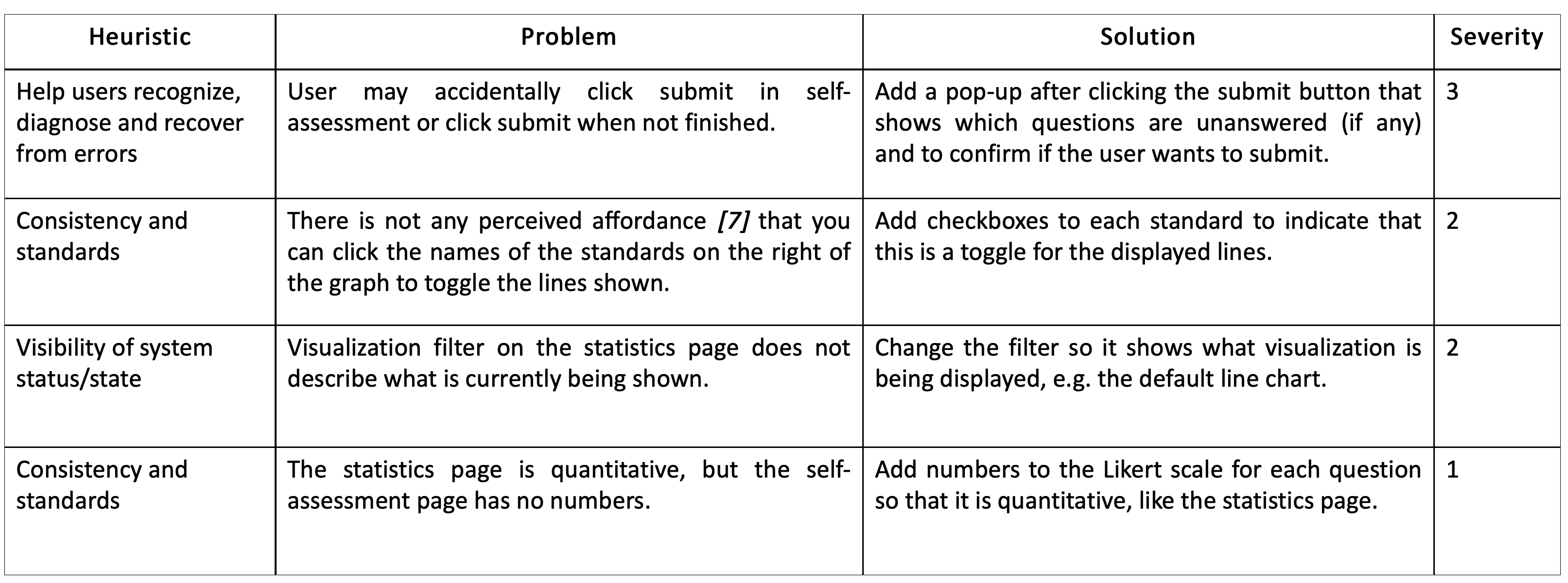
Table showing different issues with our initial prototype and potential solutions for a better second version.
Revised Prototype
The picture below shows the different changes that we made to our prototype after our meeting with our users and creating the heuristics table. Our main goal was to make the interface as comprehensible and easy to use as possible.
Next steps
Now that we have a clear visual idea of our product thanks to the sketch as well, we can start thinking about software development. We hope to seal the requirements, start the development process and begin planning the system architecture.